The challenge
White Night, an after-hours art festival within a festival, needed a brand that stood out in a crowded event space. How can we capture the imagination of art loving Aucklanders?
The strategy
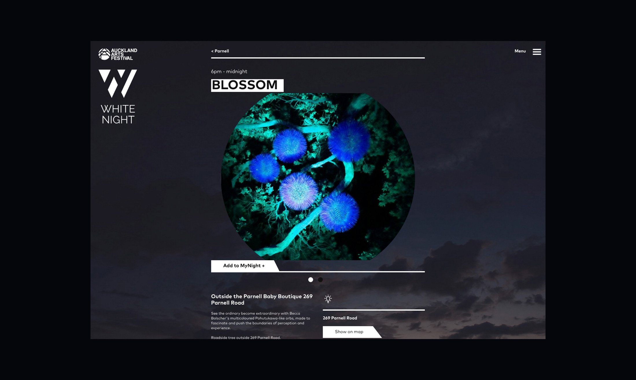
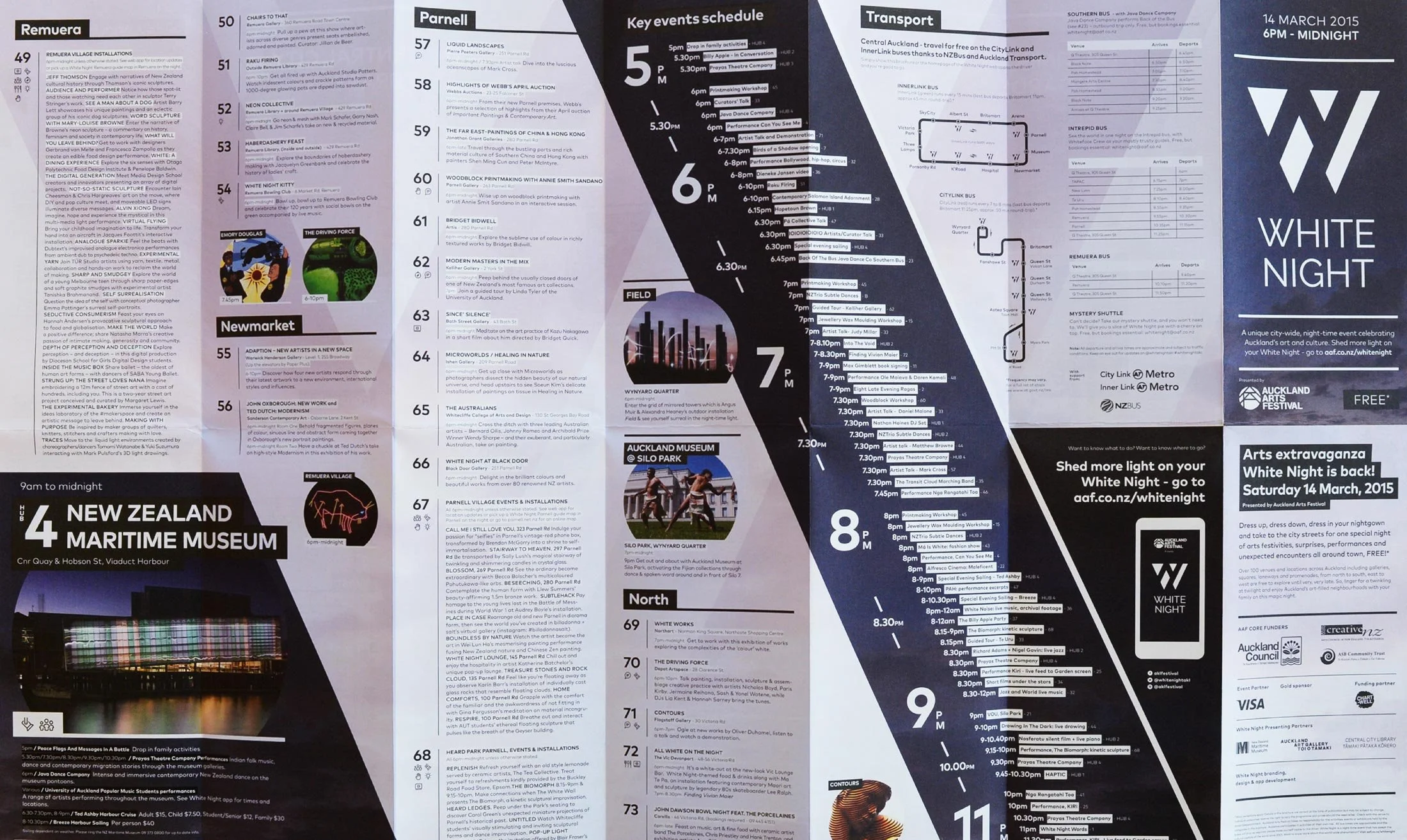
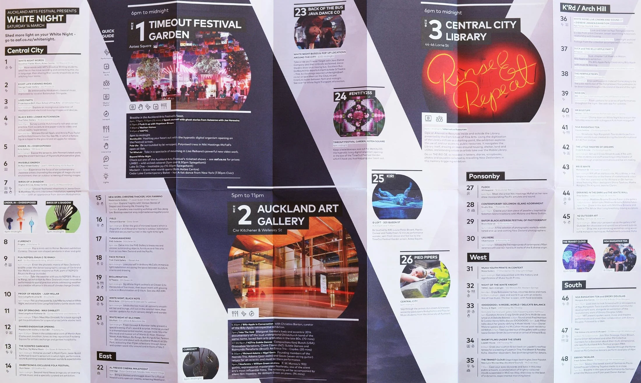
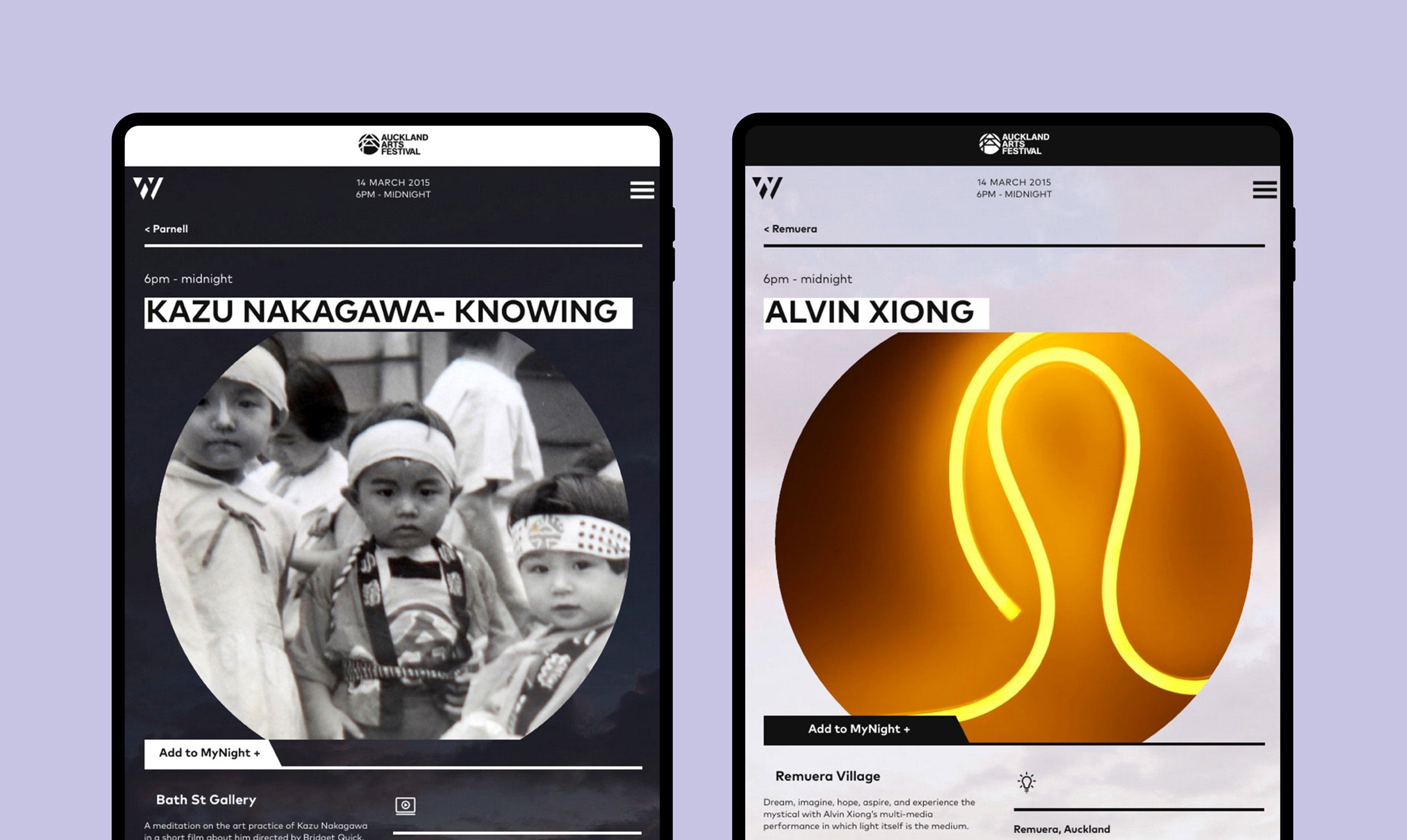
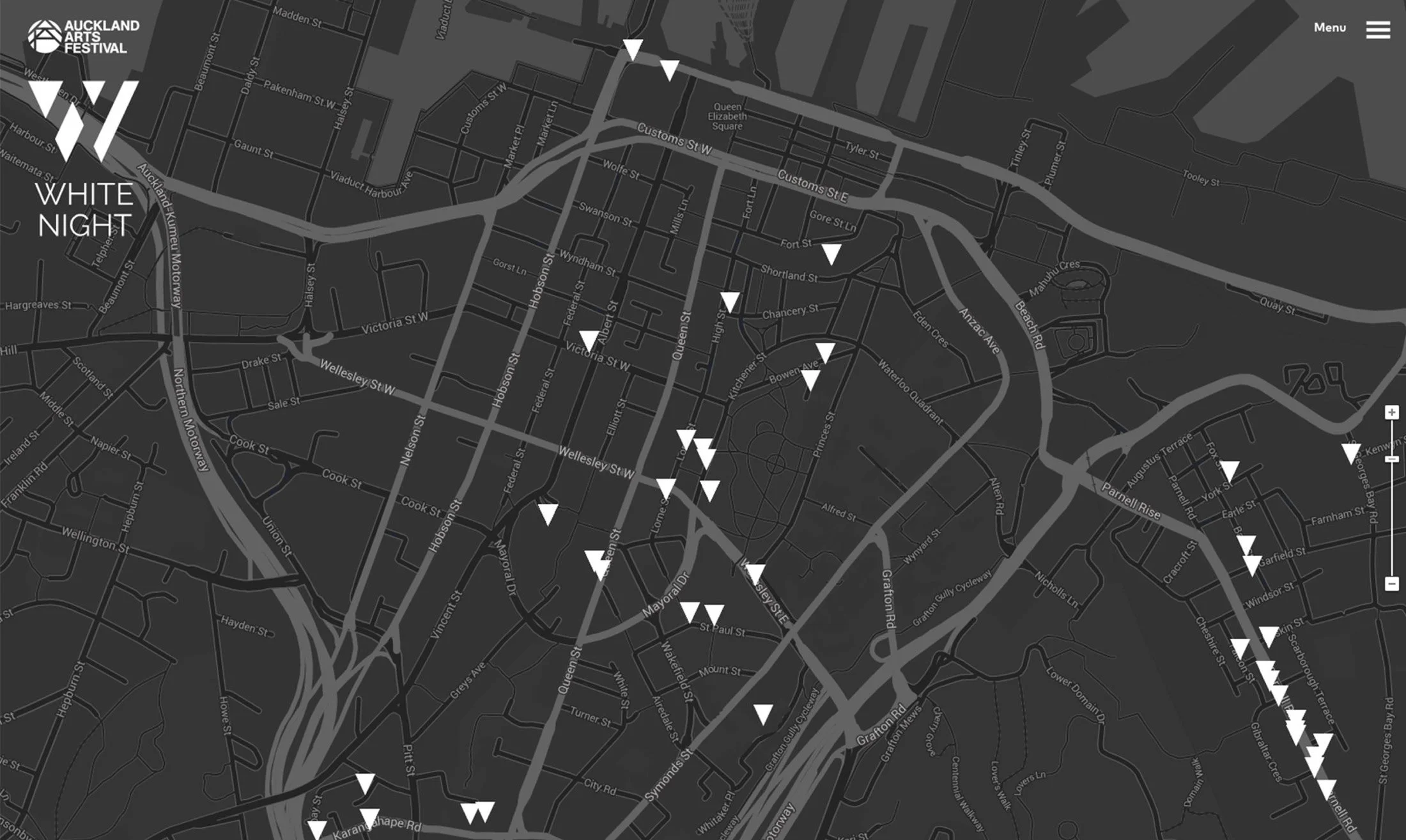
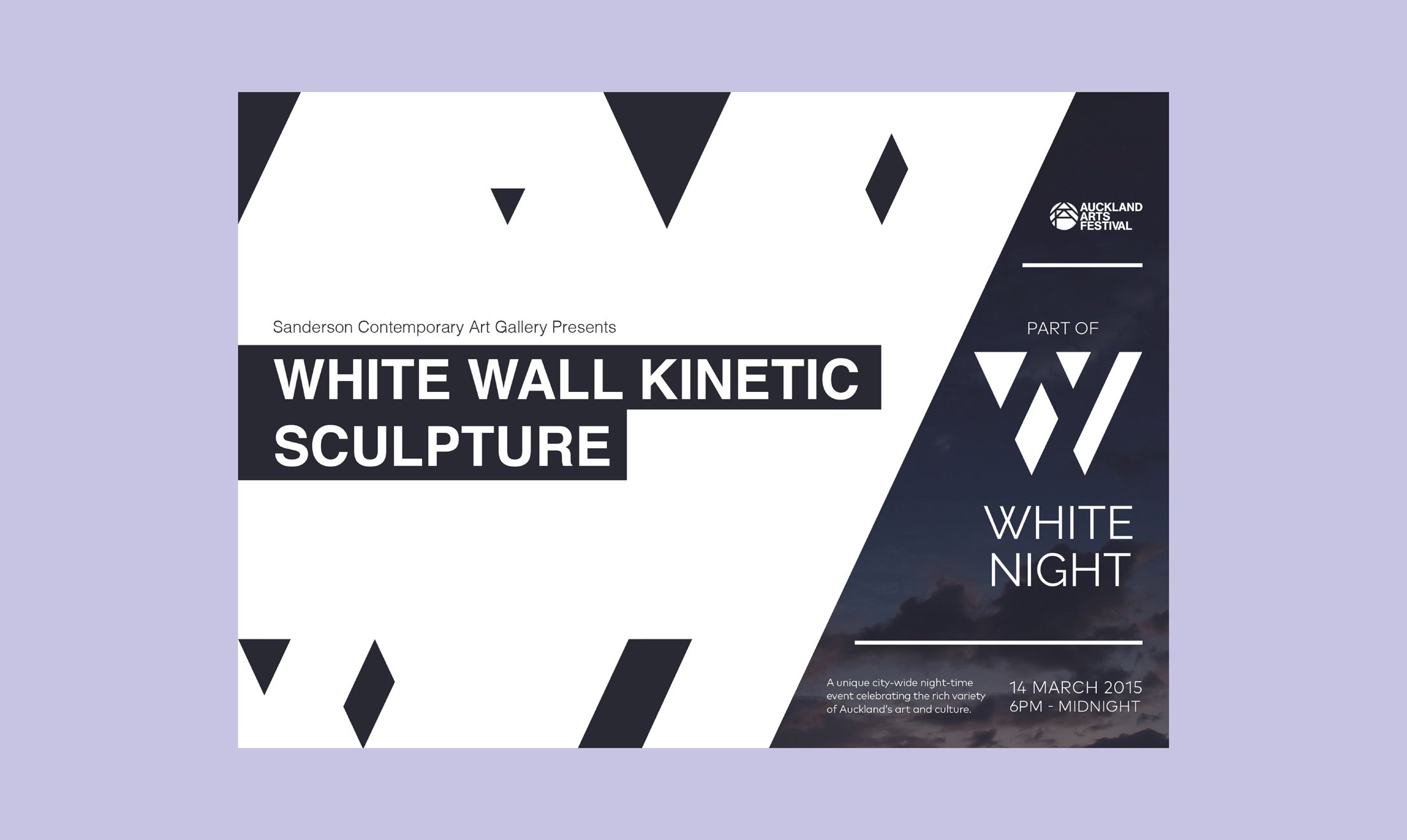
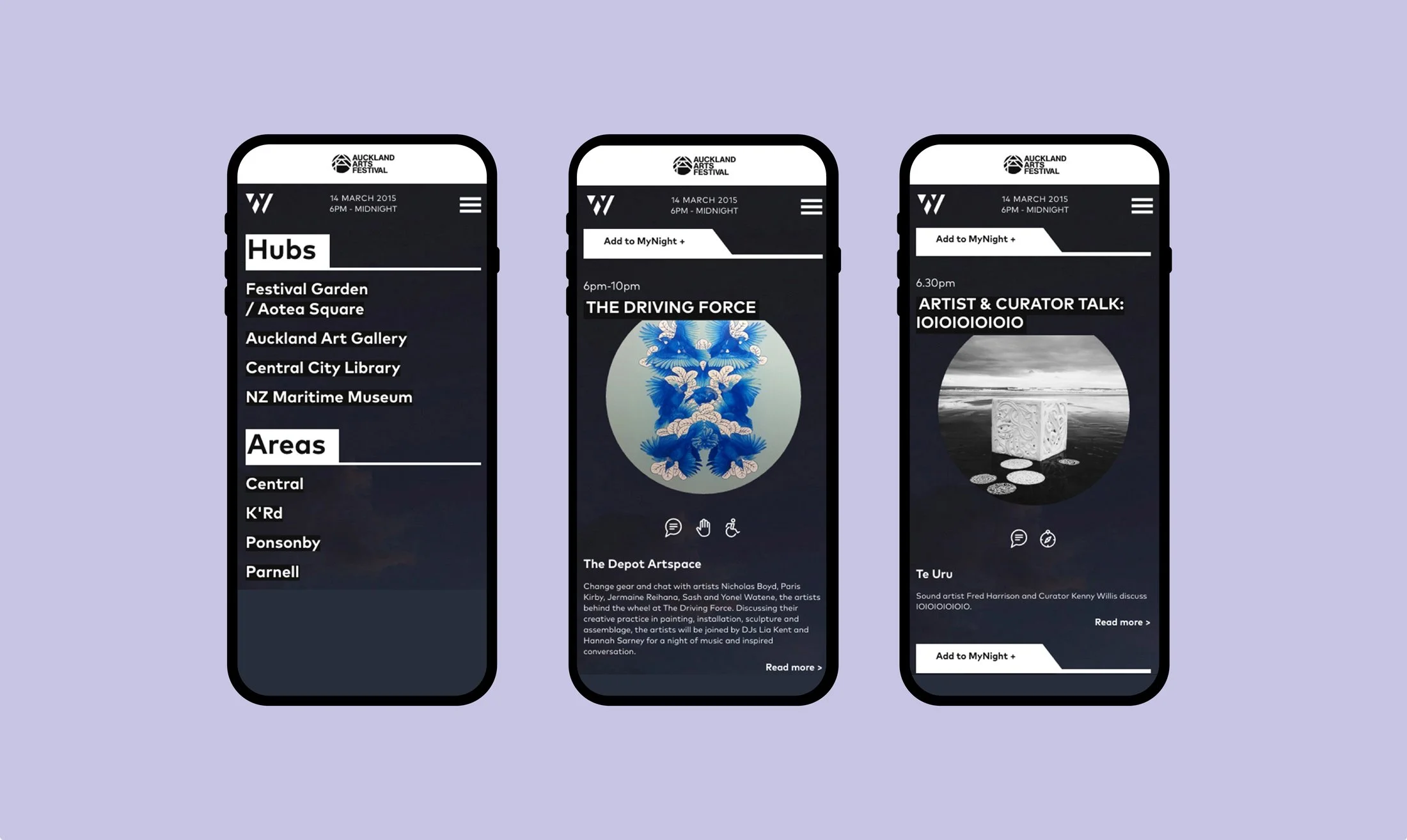
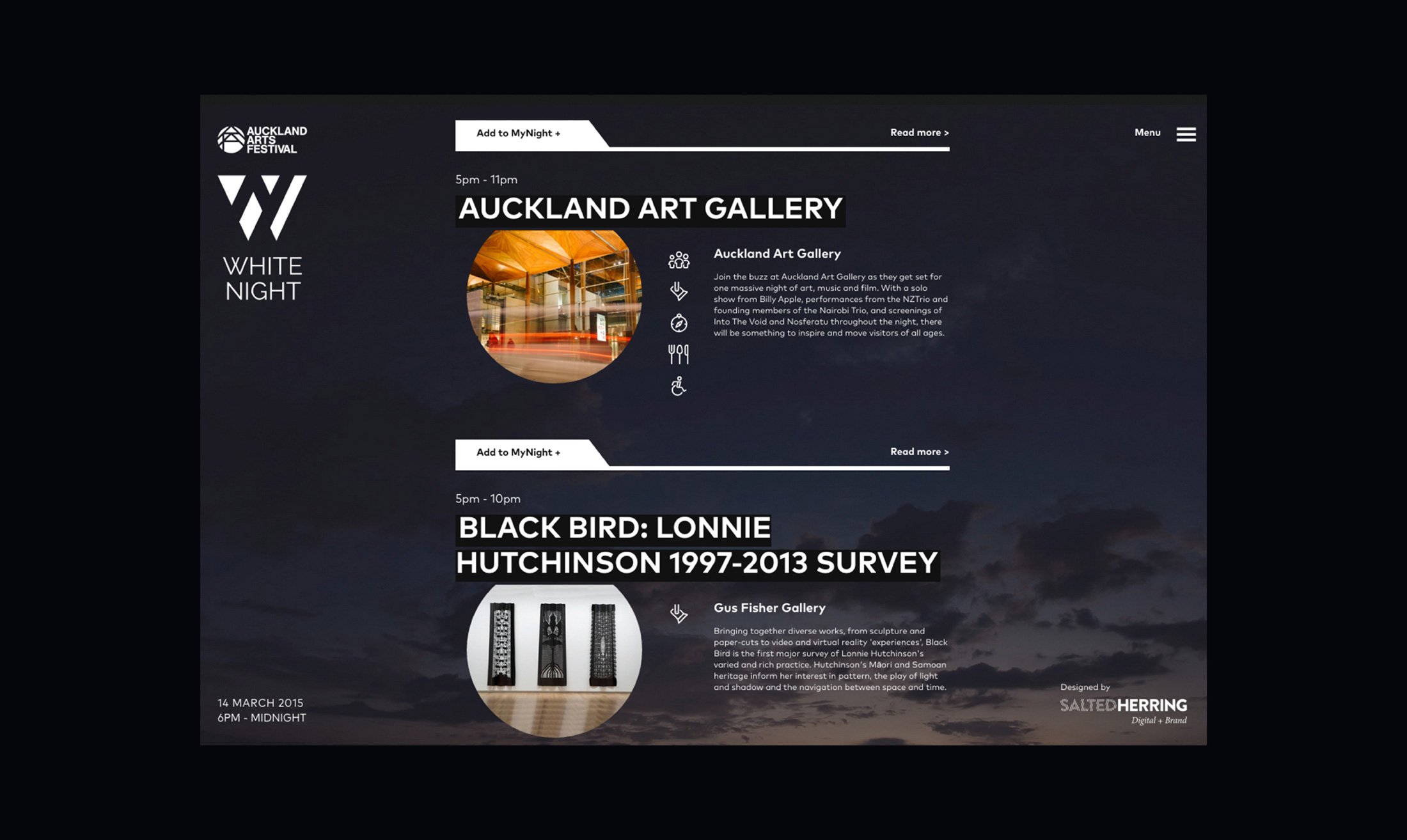
The design leaned into the oxymoron inherent in the brand name. The use of tension and opposites informed everything from the logo to the visual identity and the website design.
The results